The final assignment for IT Minor class was to redesign and develop a website for a real company. On the first day we were assigned out teams and given the company. The organization assigned to my group was United Way of Central Arkansas. They requested a smoother site, with updated information, a better way to store and organize information, easier access for agencies and donors, and to trim down the amount of pages on their current site.
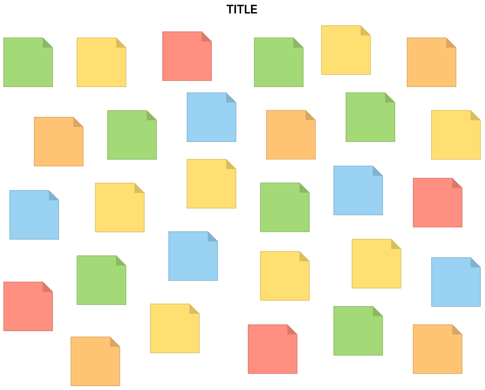
Our goal was set. My team, Abigail, Jonathan, and Jay, took that information and then we started going over their old site. It was a bit overwhelming at first. They had so much content. We decided to use the affinity diagram as our way of figuring out what to keep and get rid of. This helped us to combine pages that were similar and get rid of pages that just weren’t needed.
Once we had trimmed the pages, we started looking for themes. We decided on Outreach Pro. There were some difficulties in trying to get the theme to work so we used Elementor instead. Elementor allows you to create blocks and then copy and paste them onto every page. That is what I did.
I created style blocks and used those to keep a consistent theme. I realized ¾ way through this project, that I should have put a CSS Class on it and used the universal CSS Stylesheet. At that time though, it was easier to keep going with the design.
These are my takeaways from this project; assign pages to your team members; communicate the color theme so all pages look the same; and never say no to working with new technology just because you don’t know it, aka United Way of Central Arkansas website’s platform. I have learned a lot from this experience and I know it will stay with me throughout my career as a Web Designer and Developer.


